A question I hear all the time as a designer is regarding paint. What paint colors we use, what brand, what sheen, how to know undertones…. I get it. Paint is HARD! And no-one wants to repaint an entire room after realizing it isn’t working in the space. So, here’s the 411 on ALL THINGS PAINT!
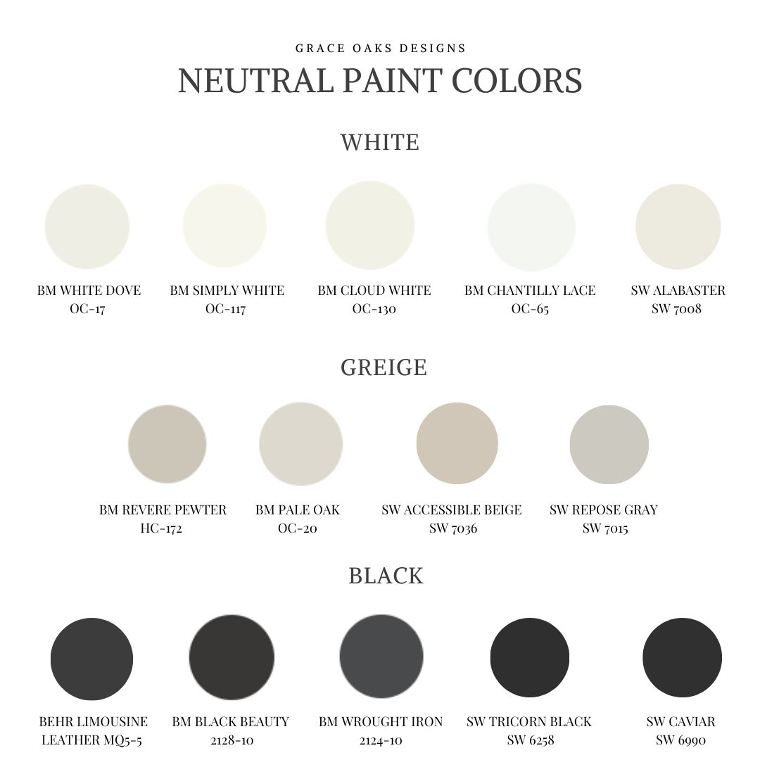
To start, we always stick to a neutral palette because that’s our style. Whites, greiges, and blacks. That’s what you’ll get from this post- the best neutral colors and our paint guide with all the tips.
OUR FAVORITE NEUTRAL PAINT COLORS

WHITE
-Benjamin Moore White Dove
-Benjamin Moore Simply White
-Benjamin Moore Cloud White
-Benjamin Moore Chantilly Lace
-Sherwin Williams Alabaster


GREIGE
-Benjamin Moore Revere Pewter
-Benjamin Moore Pale Oak
-Sherwin Williams Accessible Beige
-Sherwin Williams Repose Gray


BLACK
-Sherwin Williams Tricorn Black
-Sherwin Williams Caviar
-Behr Limousine Leather
-Benjamin Moore Black Beauty
-Benjamin Moore Wrought Iron


PAINT TIPS
SHEEN-
Paint sheen refers to how shiny the paint is. Each sheen has a durability level to consider. Most brands have sheens like flat (matte), eggshell, satin, semi-gloss, and gloss. The higher the sheen the more you see on the wall. So, for textured surfaces, you may want lower to hide it. Also, to consider the lower the sheen sometimes the harder to clean. For example, wiping away scuff marks or dirt etc is much harder on flat and sometimes eggshell. This also has more to do with the quality of paint. Always opt for at least the middle of the road with paint & primer in one across all brands. We usually go for the first or second tier option, pricier but better quality paint makes all the difference in longevity and durability.
I almost always personally select satin. It gives very little sheen, easy to wipe clean with little ones, and I like the look of a clean minimal approach keeping my walls and trim the same. Another option is to have the trim stand out making it a sheen brighter. If walls are eggshell go satin on trim, etc. I usually suggest this for my design project clients. It depends on your specific needs.

HOW-TO CHOOSE THE BEST COLOR-
I know how hard paint can be and there’s so many factors that play into WHY. First, the direction the home faces is the biggest of all. This directly relates to the lighting the house gets. Also, the exterior can make a difference because the light reflects and bounces in through the windows. Interior furniture, flooring, and textiles can play a factor since the undertones the paint takes on can pull from it’s surroundings in the space.
How do you know if a color will work? TEST IT! Here’s how- I highly suggest getting a foam posterboard or at least a thick piece of cardstock. Get a sample from the paint store- be sure to use the paint’s color code so the formula is correct if you’re color matching. Paint a large swatch on the posterboard or paper. Take this throughout the space and tape it up on the wall. The background is a true white so there’s no undertones to pull like the wall would have from previous paint colors. Also, you can move it around and watch it throughout the day. Pay attention to the lighting, interior and natural light. This gives you a much more accurate depiction if the color will work for you in your space! Try it out!

OUR FAVORITE PAINT SUPPLIES-
A great angled brush with a cushion handle, the best trim brush, and shed resistant woven rollers. I haven’t personally used a sprayer that we love. It’s on my list to figure out next. A paint sprayer is great for walls with millwork to get a very clean, perfect paint job. Also, this masking peel is amazing for windows and doors! Forget the tape and use the masking peel. Paint it on the glass then paint the window or door, and peel off the mask super easily! Makes painting those tough jobs a lot easier than dealing with tape.

I hope this guide helps with your next painting project! Click the image below to pin it to Pinterest to save for later.