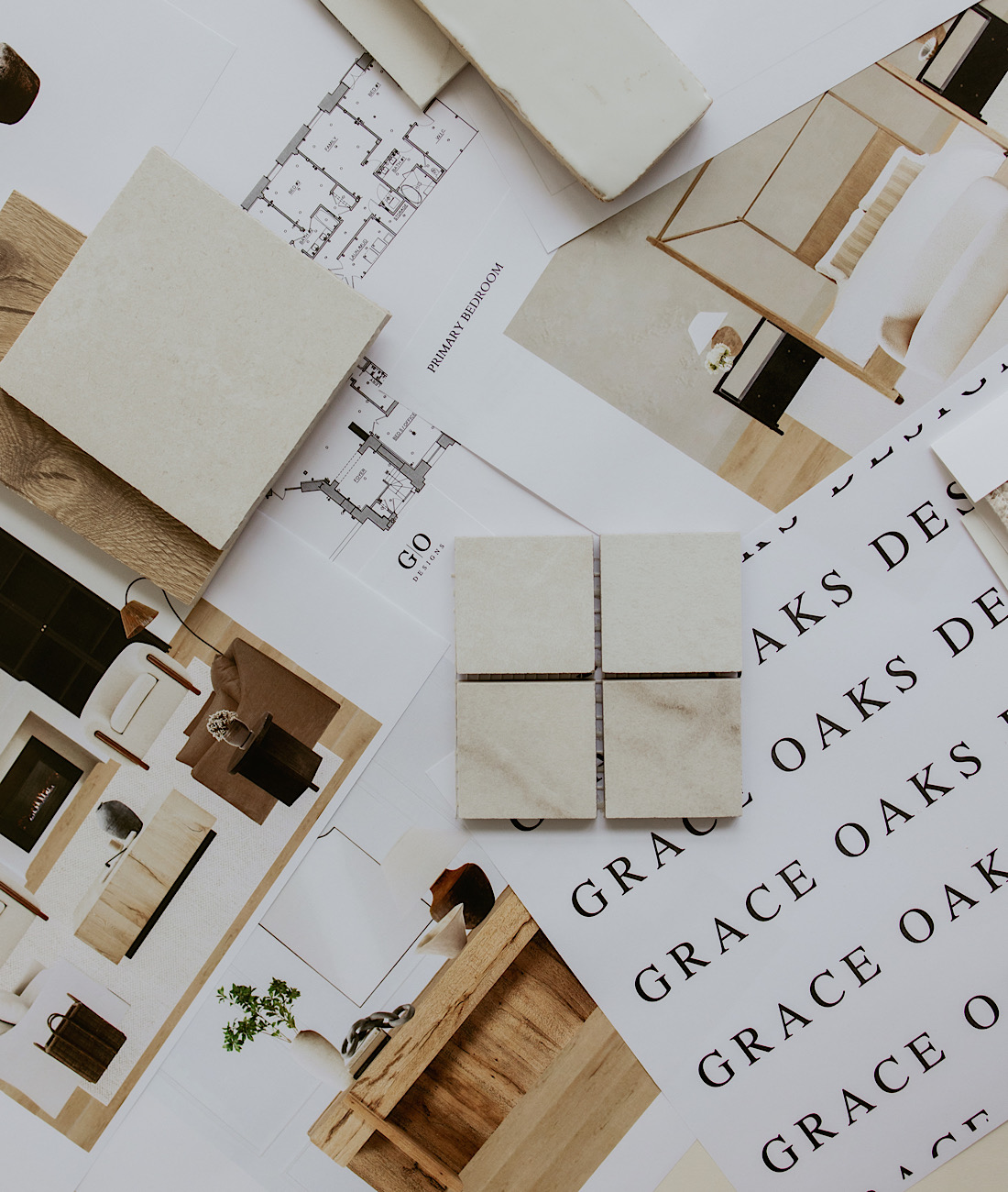
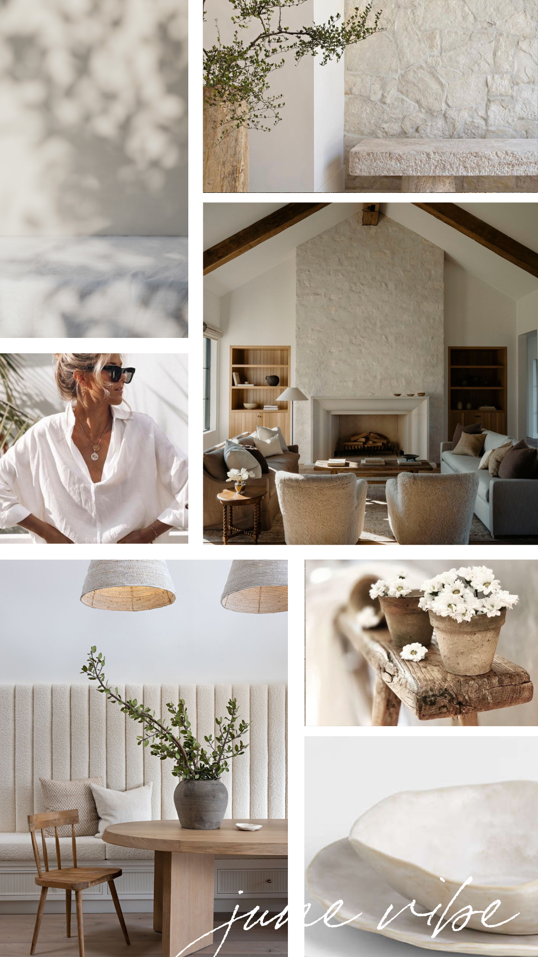
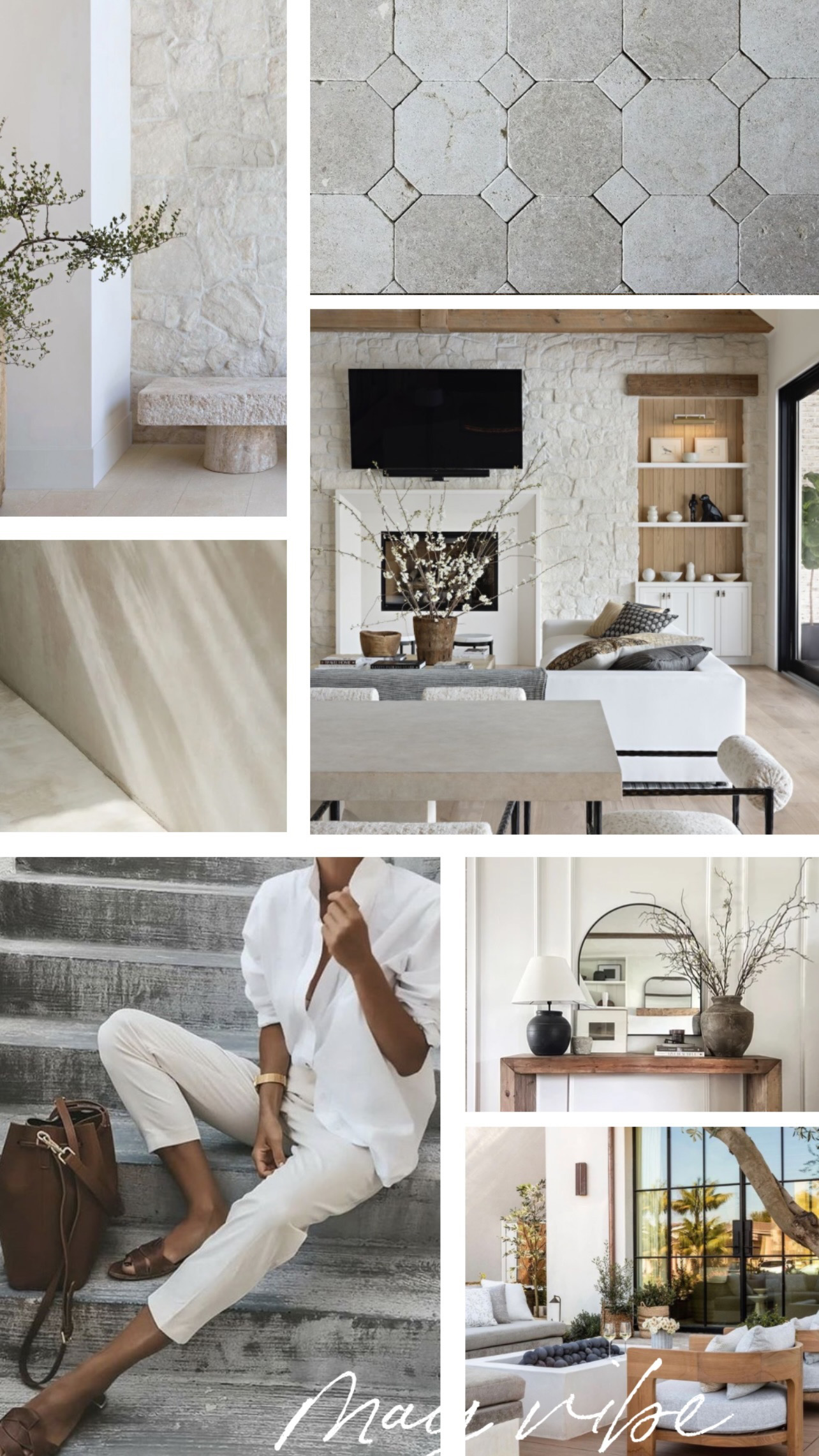
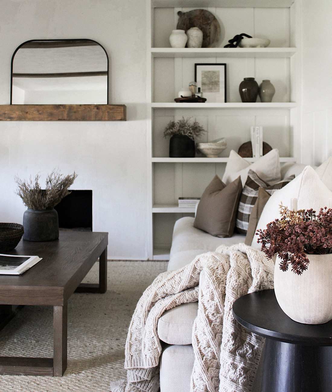
When I design a space, I consider the overall basis for a neutral, classic and timeless look. One that won’t go out of style quickly. Then, I’m able to incorporate more stylish or trendy accents in the decor, lighting, paint and finishes that are easier to swap as time passes or style shifts. The key to a modern organic style is incorporating more ethereal elements. I’ve been slowly making this shift in style throughout our home the last year using more earthy tones and elements, neutrals as usual and adding loads of texture. Refining my style has made all the difference in creating a cohesive look for my home.

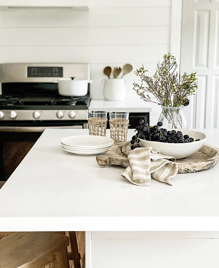
Our kitchen is the perfect example as it’s taken on a few refreshes over time, the foundation has remained the same: cabinets, counters, and flooring. We removed upper cabinets to install floating shelving, swapped light fixtures, hardware, counter stools, and decor. We recently added a few pieces to our kitchen to gravitate closer to my desired organic vibe.
SHOP OUR KITCHEN

Before we had chunkier wood floating shelves, we replaced our upper cabinets with, but I’ve been wanting a sleeker and more modern look. Our new floating shelves are from Ultra Shelf in white. They have white oak, maple, stained and painted options. You fully customize your size, color and type of shelf, and it includes the hidden bracket! The metal bracket has several hole options so you’re sure to install into the studs, and it’s designed for the shelf to slide right overtop, conveniently hiding the hardware. I can’t recommend them enough, I’m incredibly happy with the style, quality, and the affordability! We have the painted white in 2″ thick, 12″ depth.

We made our previous vent hood and while I still like its simplicity, I wanted to bring in some texture and hone in on that organic vibe more. It was a very simple DIY using plywood and feather finish to get the look of concrete/plaster. Our previous vent hood DIY can be found HERE and you can see more in my kitchen refresh II highlight on Instagram HERE on the new one. I love the added texture and how it feels more European!


A simple swap of light fixtures can truly give a space a whole new look. I spray painted this affordable oversized pendant in Rustoleum Metallic Champagne Bronze since it only came in nickel finish. An even more affordable way to change the feel of a space is with paint. Never underestimate the power of paint! I painted over the wood finish on our garage entry door and the island in the perfect greige, Benjamin Moore Revere Pewter (it’s the color on all our interior doors too).

The last piece to this mini refresh was adding a coffee bar. We have this smaller unused wall next to our pantry cabinet and it’s always felt unfinished. I got the idea to bring in some added counter space and storage by repurposing a set of our upper cabinets as lowers on this wall. We used a nice smooth piece of poplar board painted in the white epoxy like our countertops for a quartz look see more on that HERE.


I’m so happy with this mini refresh and how affordable it was to shift a few elements creating an entirely new feeling in this space. The kitchen is the center of our home, so it was important to me to create a space that evolved with the rest of our home. I’d love to hear what you think below!

SHOP OUR KITCHEN
