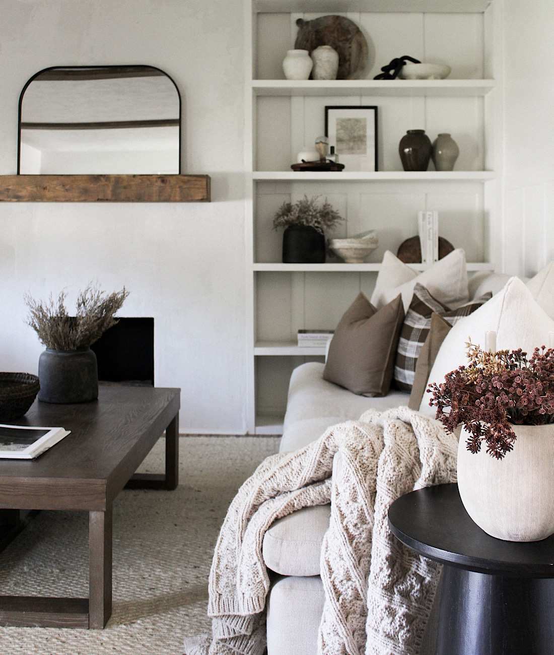
There are so many ways to approach designing built-ins. The style and layout can impact the design significantly depending on your preferences. For us, we wanted a very simple, clean look. I also decided I wanted something asymmetrical, which is usually the opposite of what I lean toward in design. There are truly so many ways to design built-ins- cabinets, open shelving, counters on top of cabinets, etc. plus the sizing factor for depth on the main focal area and the built-ins themselves.

THE DESIGN
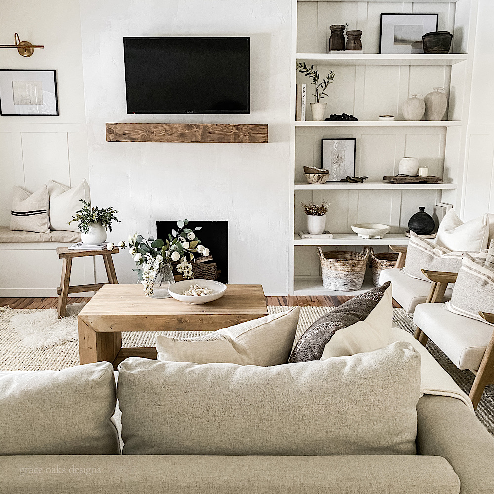
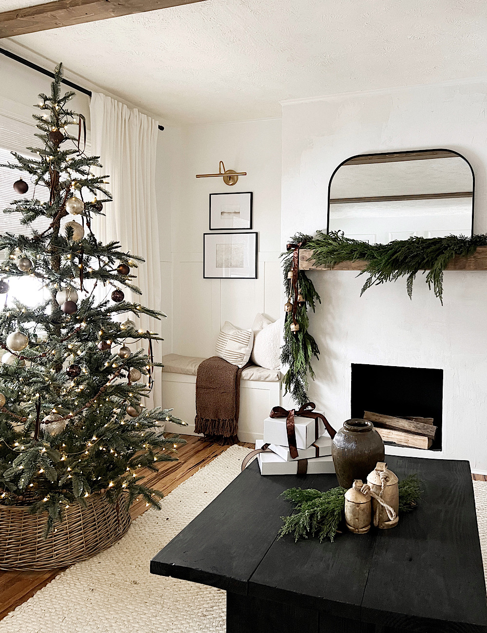
We started with our main focal, the concrete fireplace we created a few months ago. This wall isn’t even in length and the fireplace had to be off center just a bit. Knowing this, I designed the built-ins to mask this or make it look as intentional as possible by offsetting the asymmetrical design. The left side is less wide, so I opted for a built-in bench. A cozy nook for reading or extra seating as needed with art above and a picture light creates a very intentional space. Having more space on the right I created this space to be our floor to ceiling built-in shelves. Added character to a simple, sleek design really creates some interest here. Also, a major factor in my design for our built-ins was keeping it narrower to not eat into our living space too much. It was important in the design to keep the shelves in line with the fireplace for a sleek, simple look and not butt out depth wise from the fireplace. There are so many ways to design built-ins, this is what worked best for our space.

TUTORIAL
-We began by framing out the space attaching to our concrete fireplace surround. We started with 2×12 pine attaching directly to our concrete surround and the wall on both sides. Then, again on the bottom and ceiling for the top, be sure to hit the studs.
*chose 2×12 for a thick substantial framed look and the ease of not cutting + piecing together MDF or pricey very smooth plywood.

-This wall had board & batten half way up the wall to start with for our entire living room. We continued the battens all the way to the ceiling to add some character for behind the shelves.

-Next, added the shelves across. Again, we used 2×12 to match our framing width. Attached the shelves using small 1″ metal corner brackets and screws to the shelf and side pieces.

-Once the shelves were in we finished the structure off with 1×2 select pine to trim out the front. Adding it as front faces for sides, top, bottom, and in front of each shelf. It created a very clean and finished look. We used finishing nails to attach directly into 2x12s.

-To finish the seam at the top where the top 2×12 frame met the ceiling we added cove moulding up against the ceiling. Again, using the nail gun to attach directly into it.

-On the opposite side framed out the built-in bench using 2x4s. Same as before determined our size, met the framing to the fireplace and opposite wall, attaching to the studs.
-Once the framing was in, including middle bracing in 2x4s covered in plywood using nails.

-Added MDF like our board & batten walls to trim out the front face of the bench for a simple, clean trimming. The top we left smooth plywood since we’re adding a seat cushion.

-Lastly, filled nail holes with wood filler, and caulked using paintable trim caulk on all seams, and where built-ins met ceiling and wall. Then, painted everything to match our walls, Benjamin Moore White Dove.

I love the character it added to our space, and how it really transformed our entire living room. Our approach was really simple and affordable, a definite higher end look that created so much impact! Would you add built-ins to your space?
